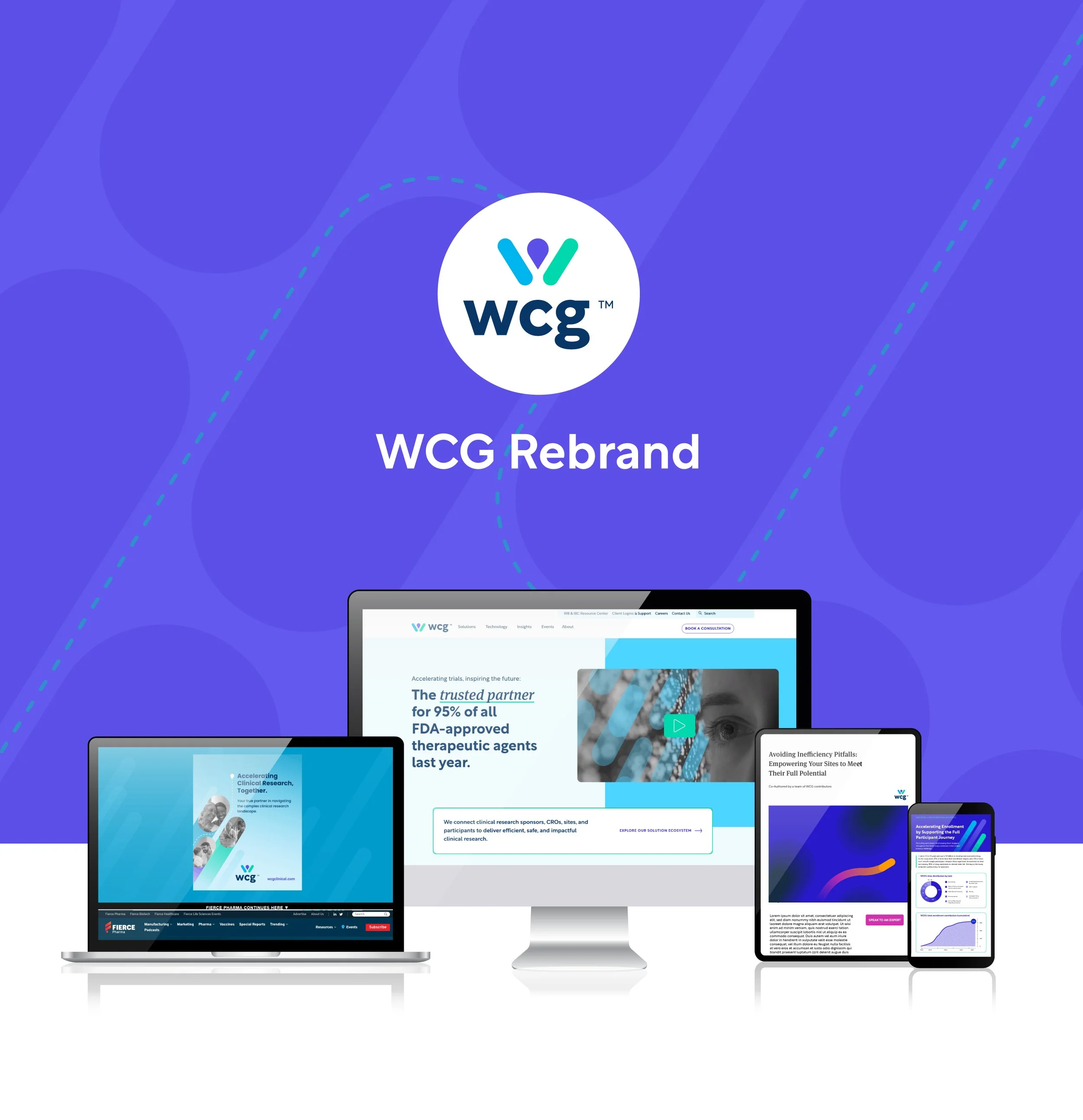
In 2022, my team was tasked with the rebranding of the WCG corporate identity.
For 12 months, I led a completely inhouse transformation of the company leading to the completion and reveal of the new brand in June 2023.
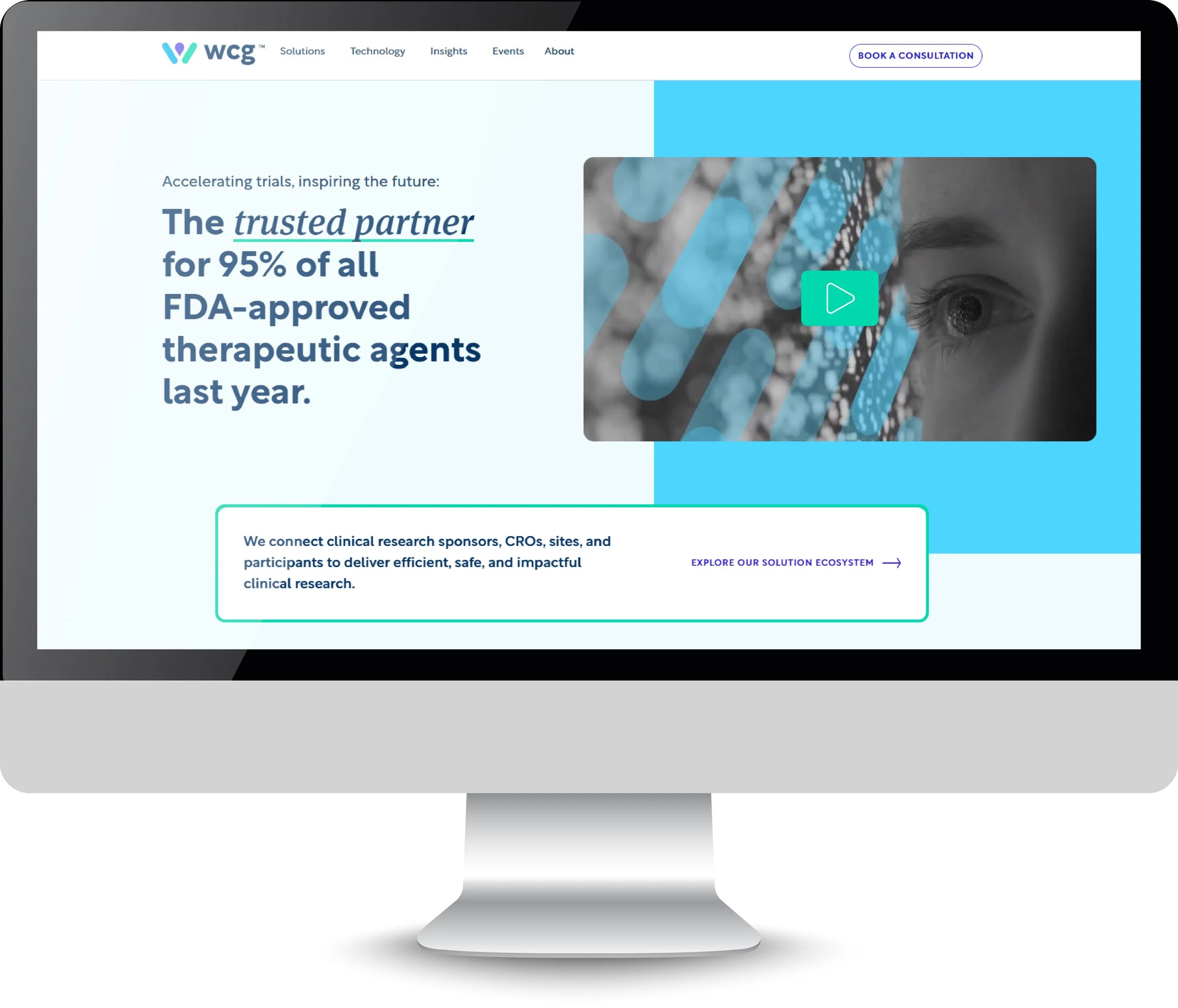
As you will see below, this rebrand included all external and internal corporate and marketing materials, a brand launch campaign and video, and a complete website rebuild.
Download below to see the full brand PDF:
Logo Design
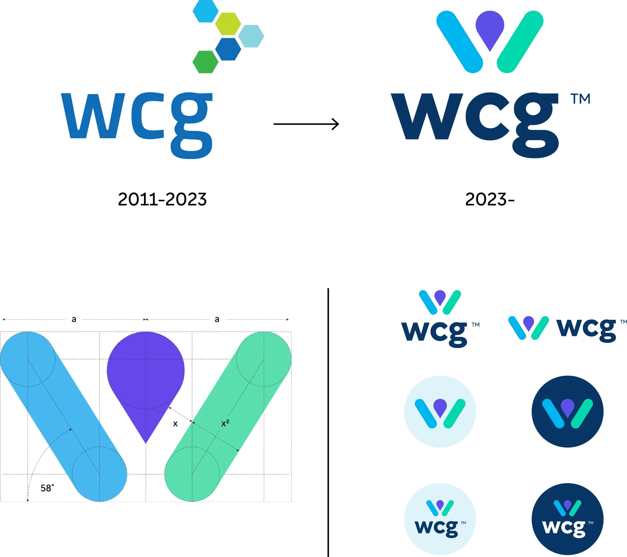
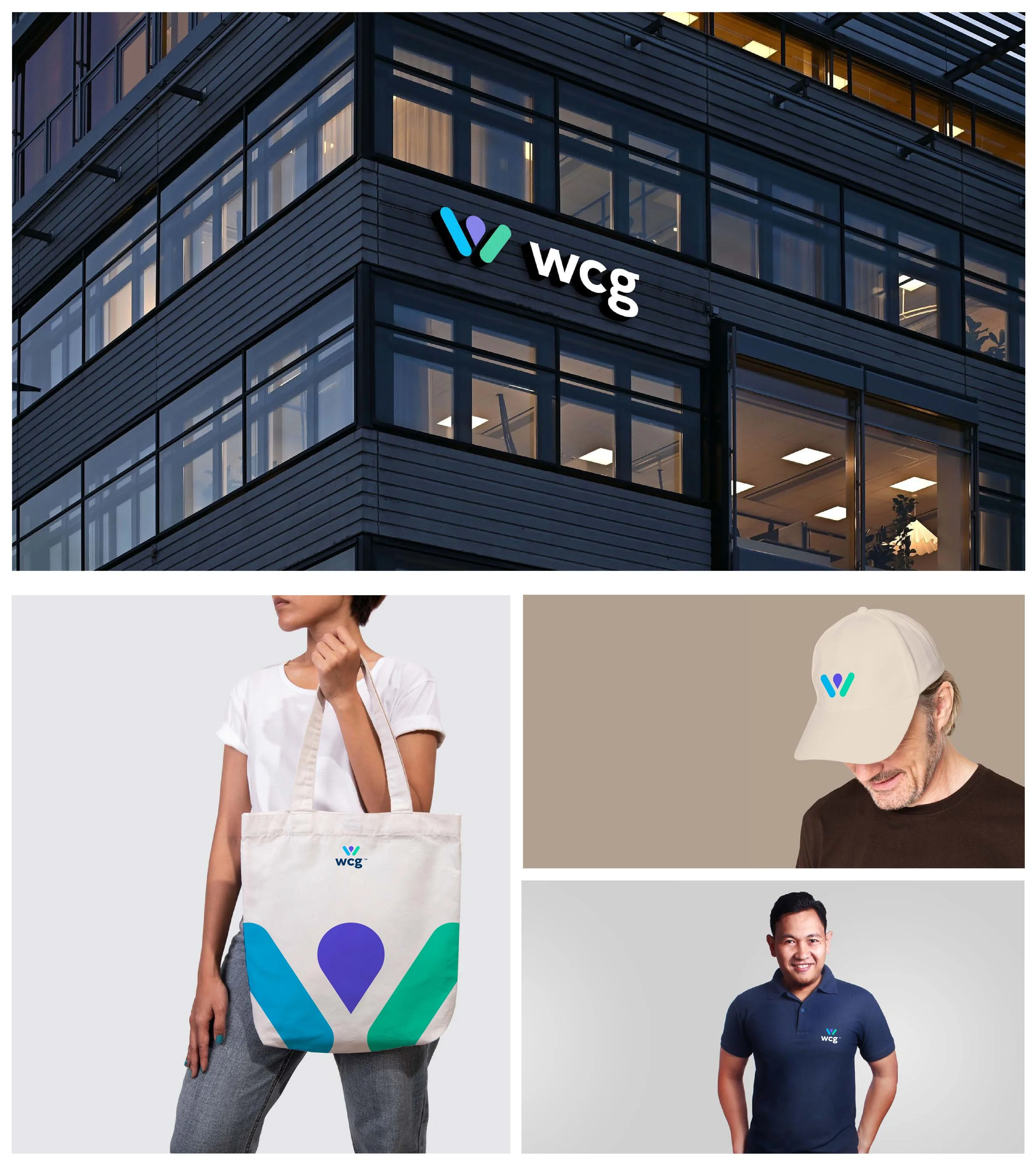
I designed the logo mark based on brand attributes and a brand essence we pinpointed through months of market research with existing clients, non-clients, focus groups, and external stakeholders.
The logo mark represents not only a “W” for WCG, but a patient with their arms reaching out to signify the end goal for the work WCG does (advance research to help save lives).
I also worked in a “map icon” to the design which communicates that the patient is at the end of everything we do, and also to communicate to clients that we will help them reach their next research milestones.
Colors
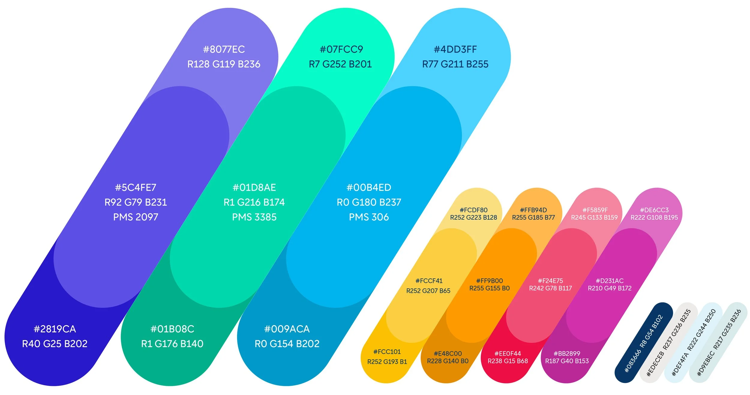
The brand colors were chosen to as nod to WCG’s past (the green and blue) and to modernize us for the future. It is more in line with contemporary brands in the tech/healthcare space.
We made sure to align the brand’s primary colors to some of the key attributes we wanted to convey, based on internal conversation and market research. They include:
Purple: Wisdom, problem solver, creative
Green: Quality, growth, decisiveness
Blue: Trust, loyalty, confidence, dependable
Our secondary colors were chosen to add a unique range of colors not often seen in healthcare and make us look more dynamic and bold.
Website
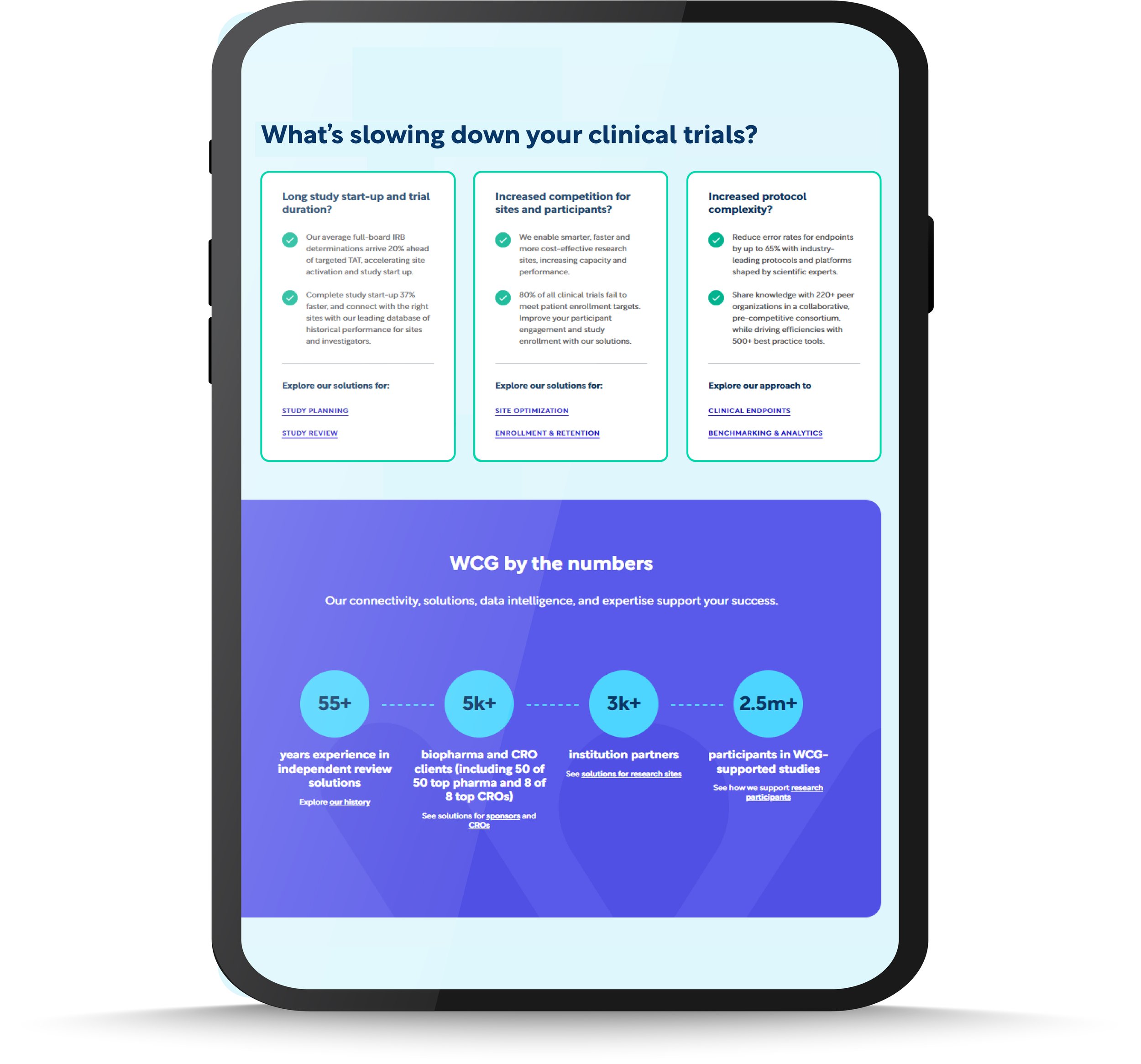
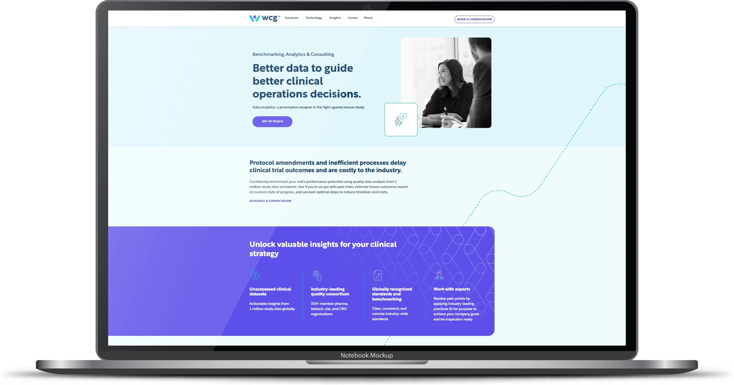
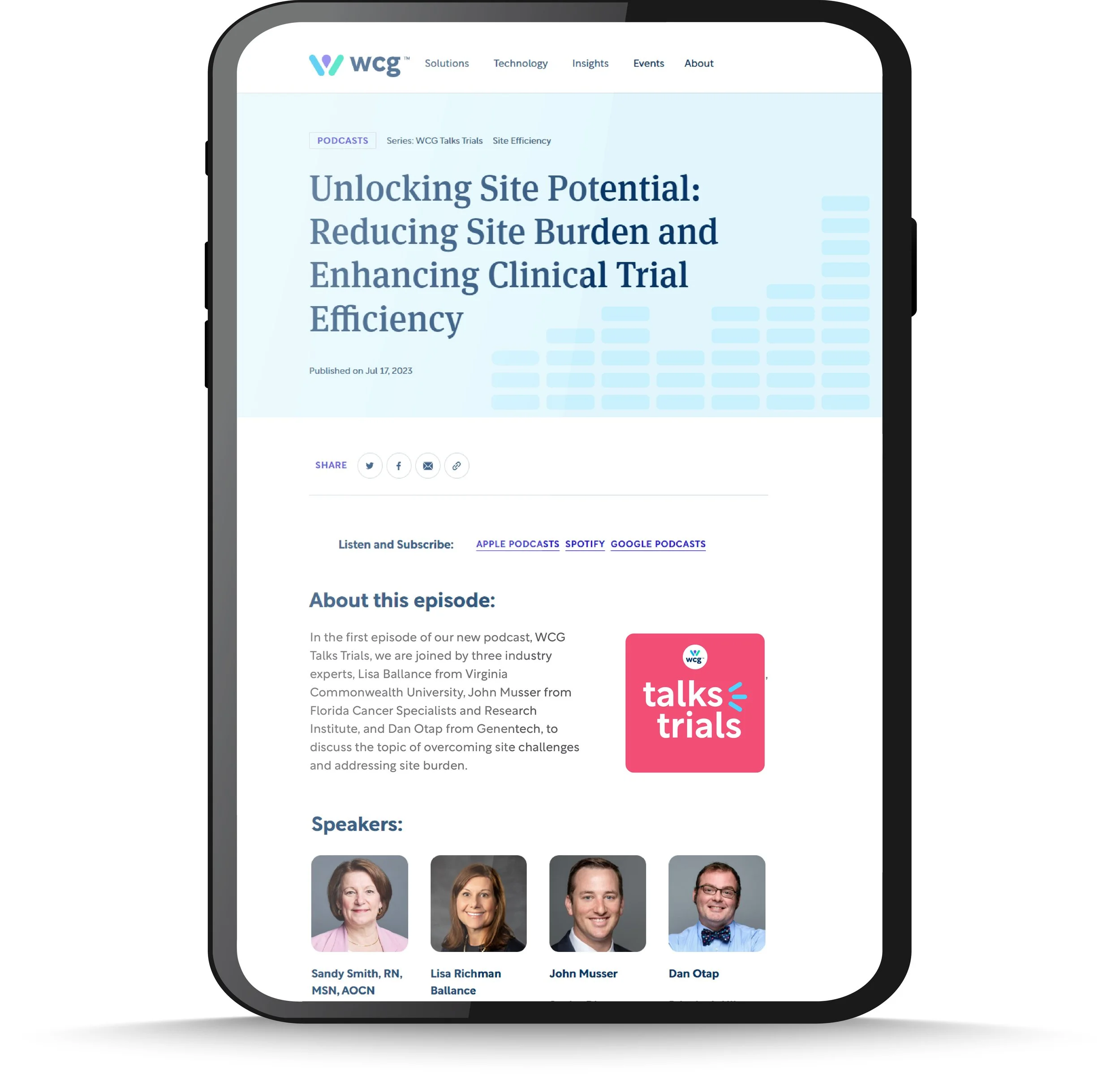
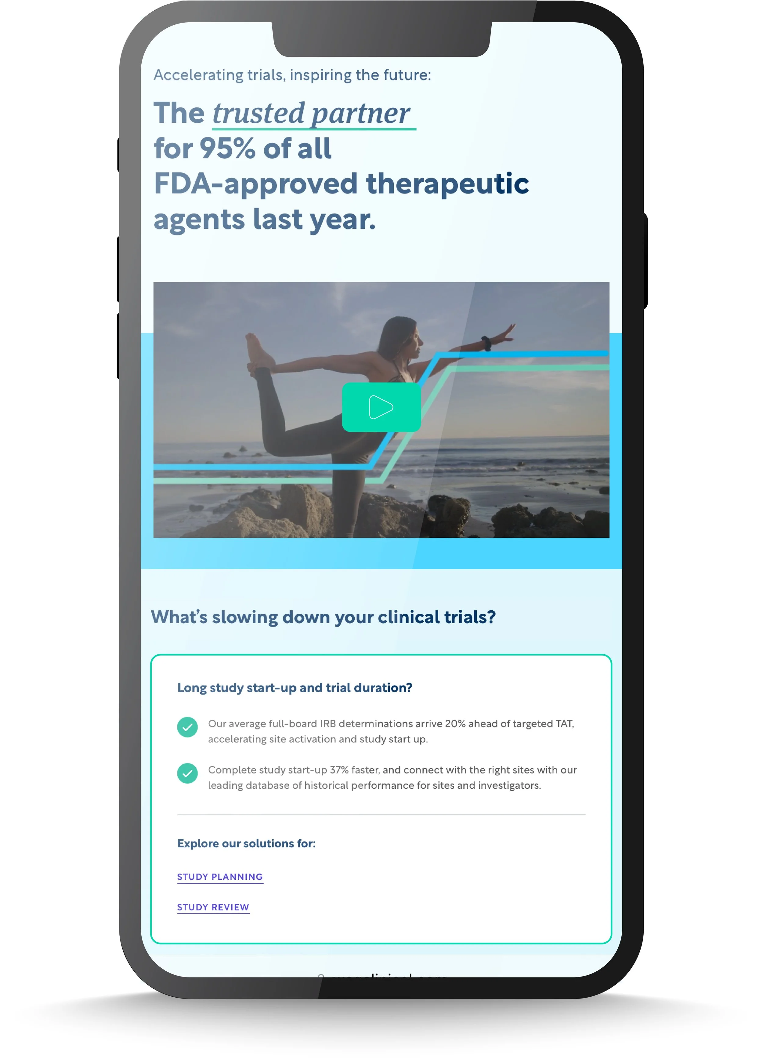
We worked with a design firm to rebuild our website from the ground up.
Central to the build was to simplify the style and let the bold colors, illustrations, patterns do the talking.
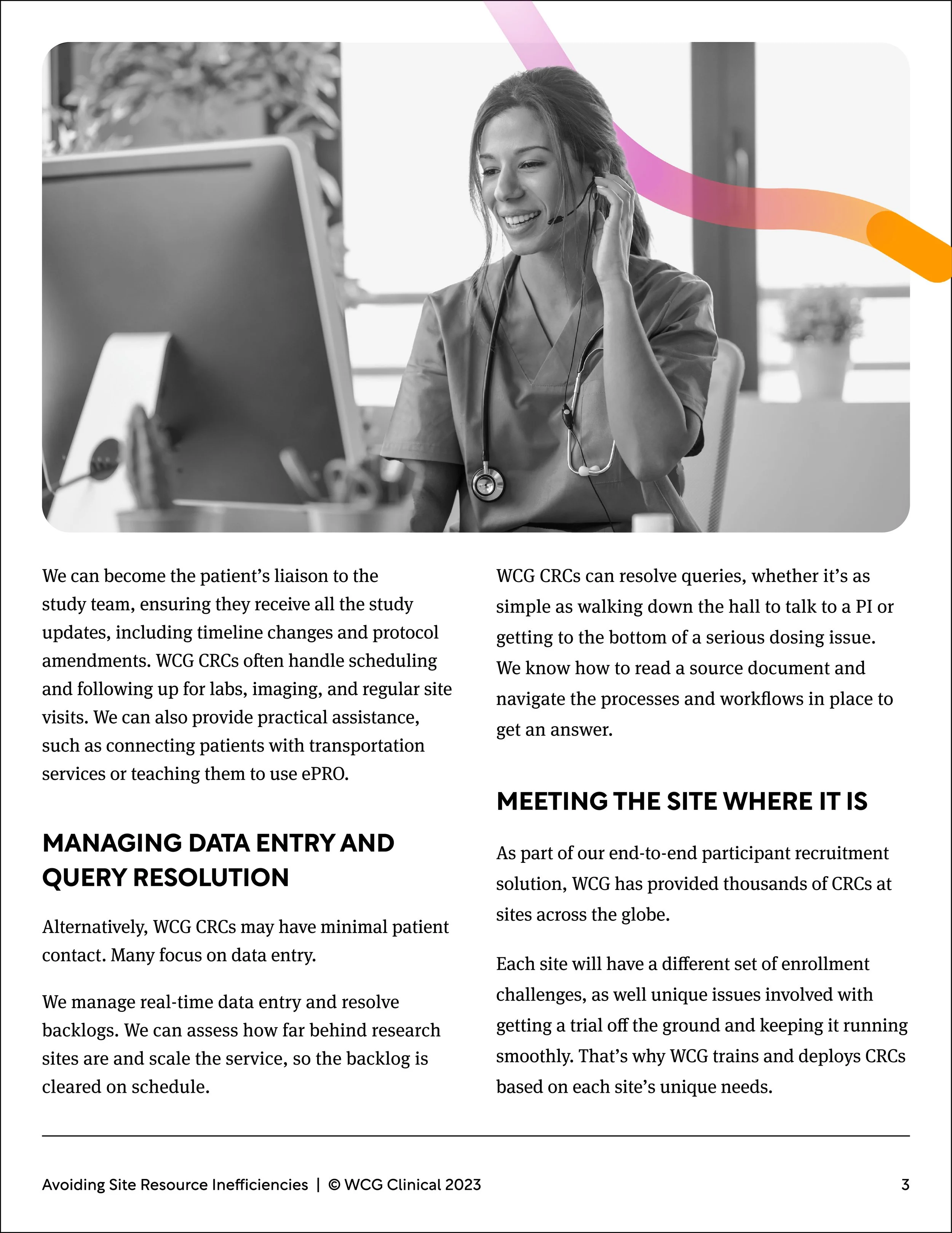
Historically, WCG’s websites have been very dense with text and stock photos. While we did bring in stock imagery, it was largely toned down in preference for our illustrations and patterns.
Podcast
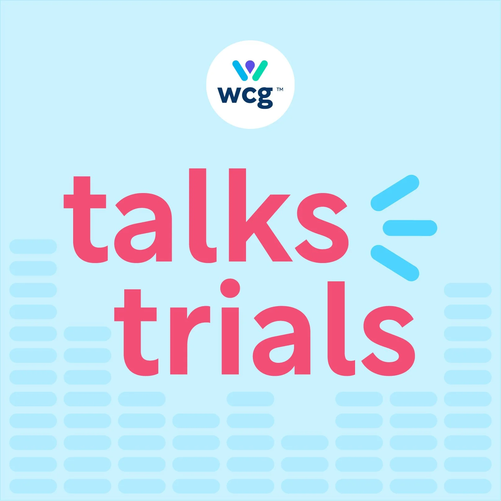
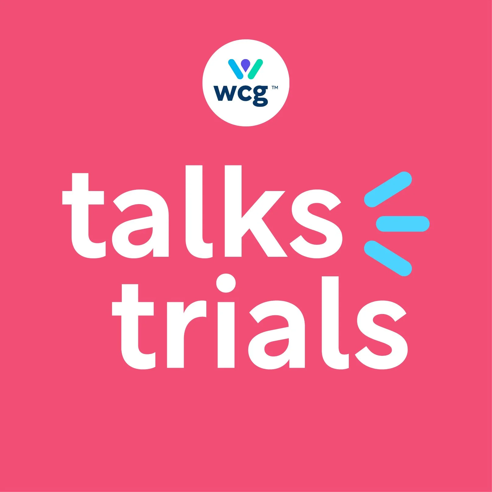
We launched the WCG Talks Trials podcast in unison with the rebrand.
WCG had a longstanding podcast that never was really brought into the brand or given it’s own look and feel.
We felt there was an opportunity to use the new brand colors and elements to carve out it’s own unique color scheme and branding.
This new branding was fresh and playful and would reflect the newer direction of the podcast. We decided to follow a shorter 10-15 minute episode format that was more conversational in tone as opposed to the historically longer and more formal episodes of the past.
In the World
Illustrations/
Patterns
One of the more unique elements to the new brand is the pattern illustration work.
We wanted the brand to be differentiated from others in the healthcare space. Most brands tend to over index on stock imagery to build out their brand. They are playing it safe, and it comes across as generic.
We wanted to take a more abstract approach that focused on visual communication of concepts through illustrations and patterns using elements of our brand logo mark such as the pill shape and map icon.
These patterns allow us to communicate the attributes of our brand and our key values and differentiators in a completely unique and bold way.
Here you can see a wide range of our visual communication concepts and colors.
Brand Anthem
As the overseer of the brand launch campaign and creative director for the brand launch video, I had several goals in mind that this video needed to accomplish.
It was imperative for WCG’s clients to remain the “hero” in their own story, so we made a conscious effort to story tell without mentioning WCG by name until the very end.
We also decided to make this video less about the rebrand itself and more about the story of clinical research, the current climate in which it exists, and the ways WCG can help our clients on their research journeys.
Collateral
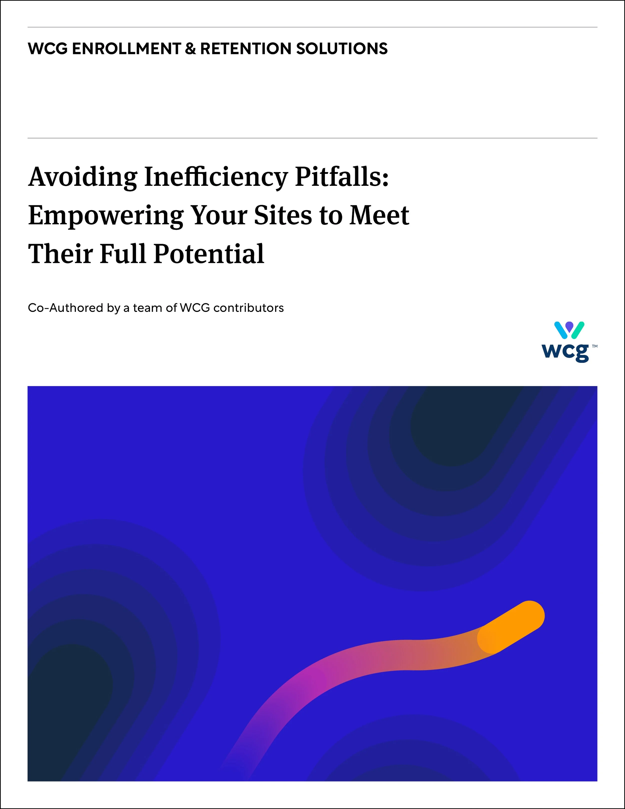
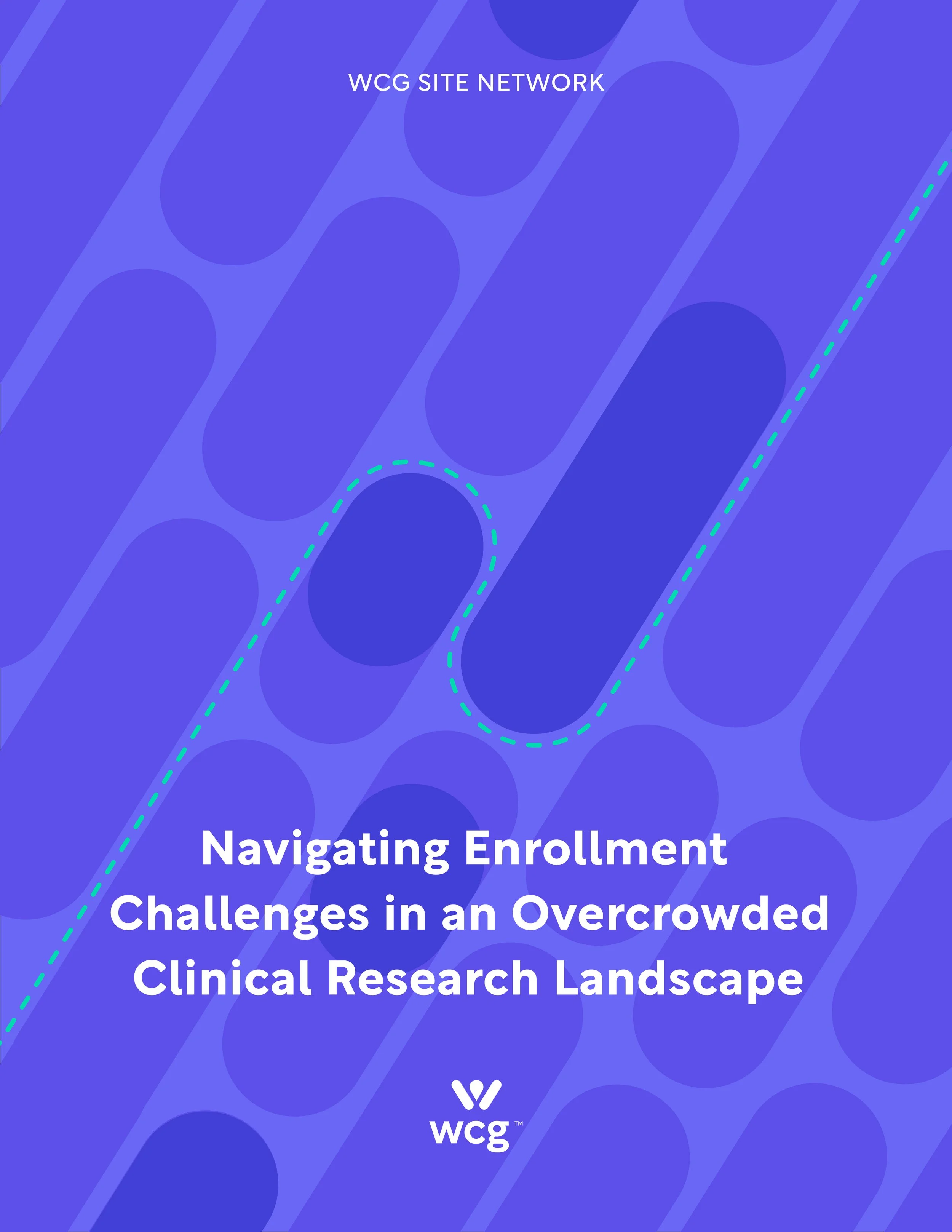
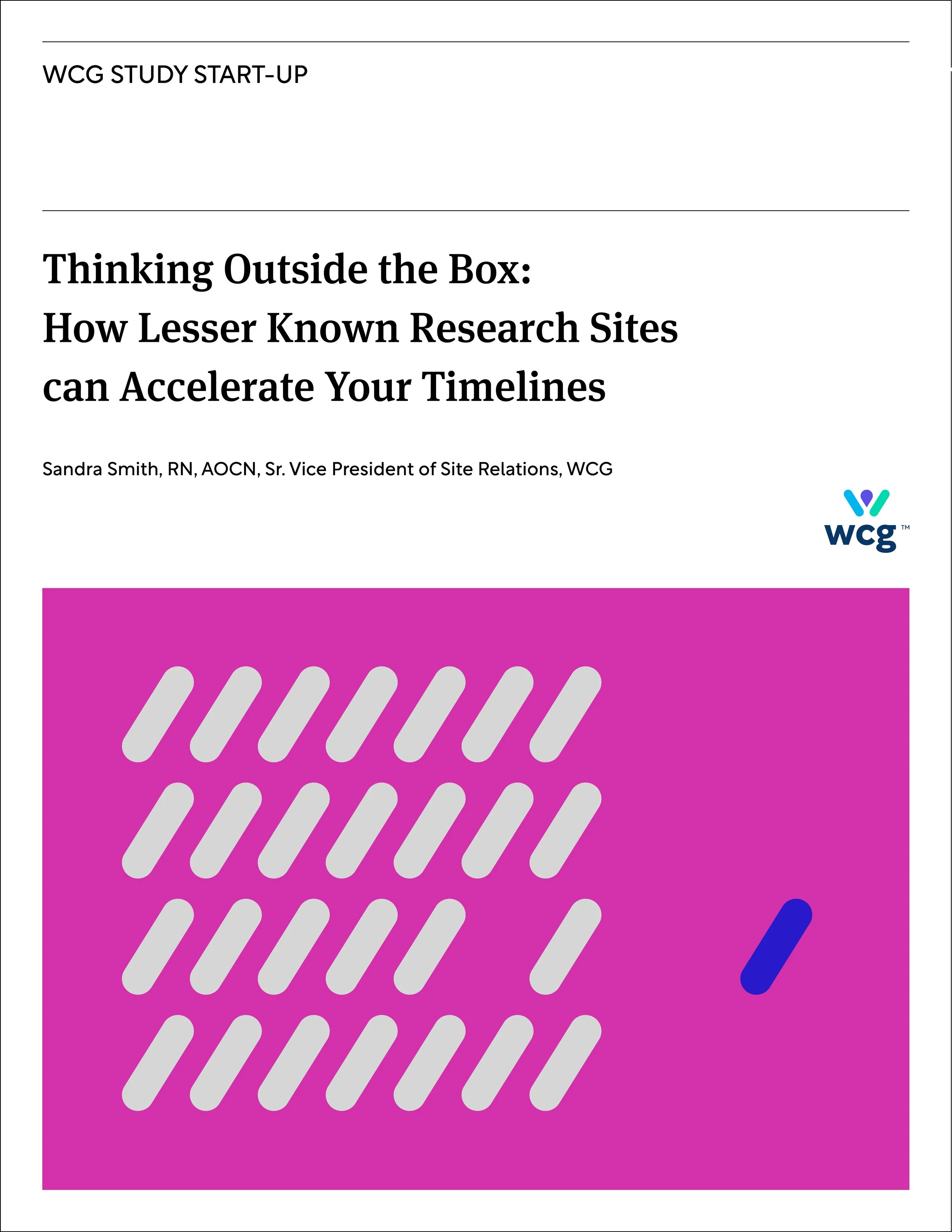
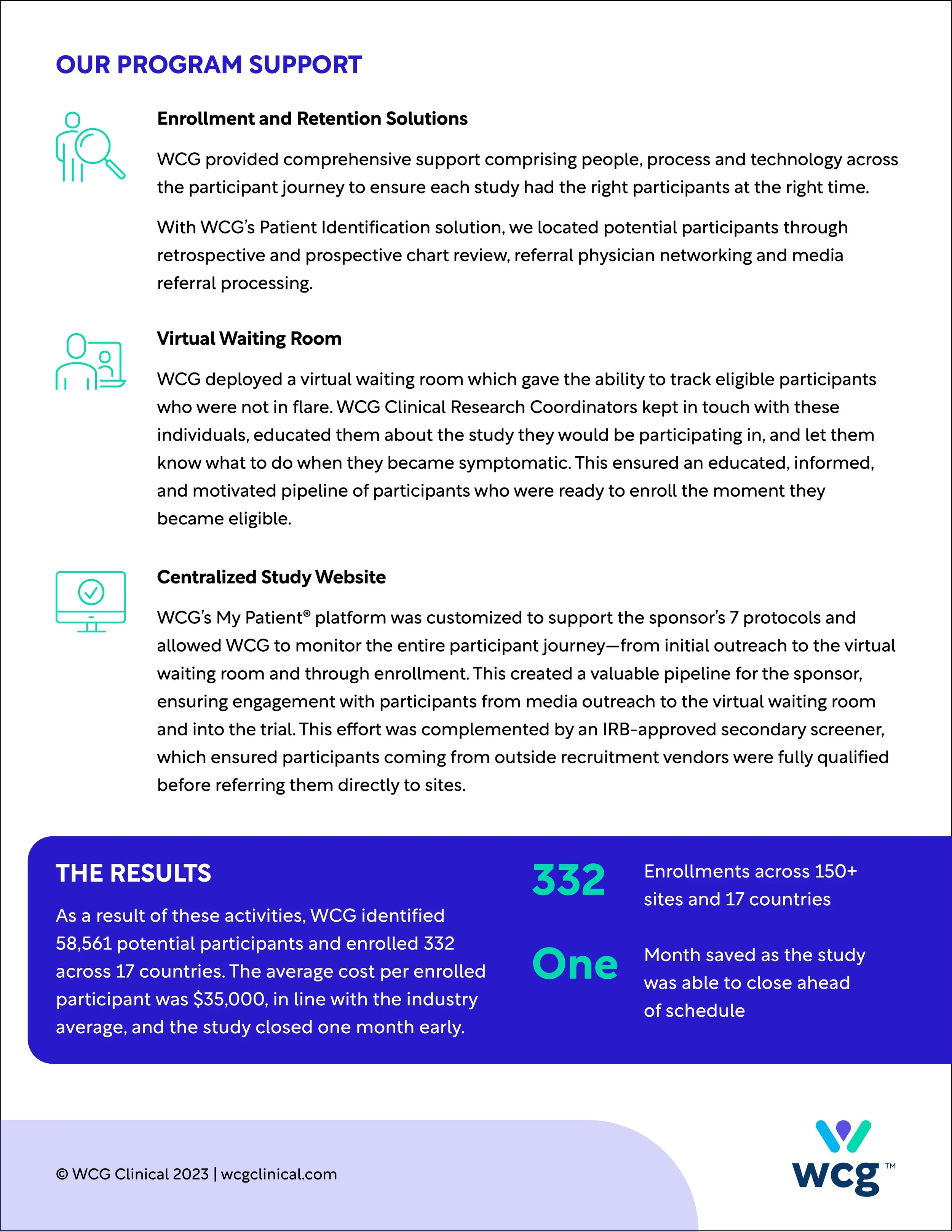
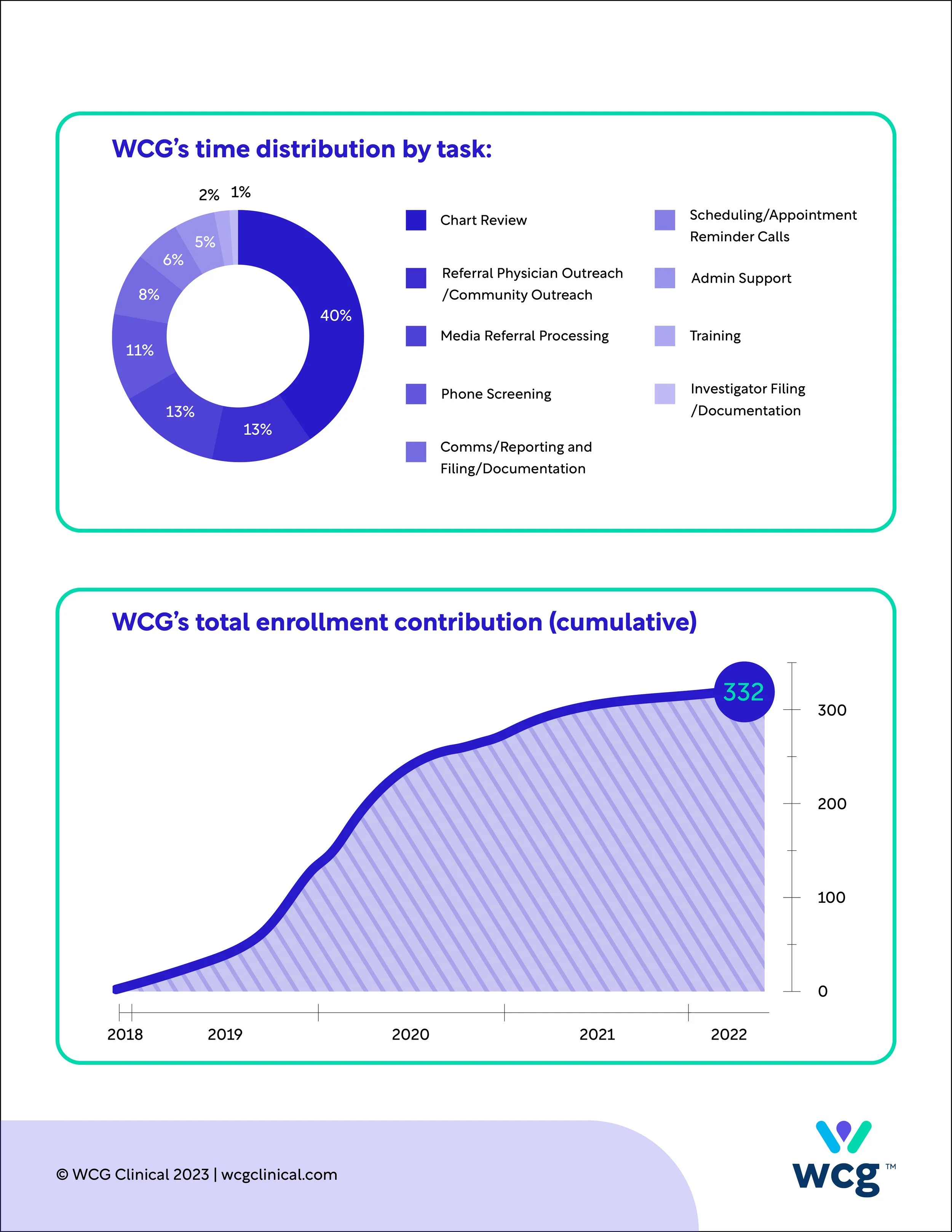
One of the biggest goals of our rebrand was to make our content feel more modern and bursting with color. The new brand being very warm, dynamic and bold, we wanted our content to communicate those attributes.
Utilizing the bold new color pallet and custom patterns/illustrations mentioned above, we rebuilt our templates to allow for maximum flexibility and brand expression within our designs.
We wanted each piece we did to feel custom, but also easily be recognizable as WCG. Here you can see the range of a few of our pieces.
Navigating complex problems
Connection / Partnership
Acceleration / Reaching new heights
Depth of expertise / Targeted
Advancement
Connection / Being the missing link
Acceleration / Making up time
Diversity / Working together

